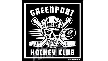
A well-designed car magnet is a powerful advertising tool. Although many design considerations go into the creation of a successfully designed car magnet, the choices made concerning the text that appears on the car magnet is one of the most important. Without clear and legible text, no one will receive your message.
By nature, logo car magnets tend to be small; therefore, it is imperative to limit the amount of text. Passing motorists have a very short period of time to view and read your advertisement. They also need to be able to locate and jot down your contact information quickly and easily. Excessive amounts of text can be confusing and detract from your message.
Text Color
 The color of the text should be in high contrast to the magnet’s background color. This contrast will make your message more easily read. Bright and bold colors work very well on a darker background; and they will grab the reader’s attention. Therefore, to make your sign easy to read, choose light-colored text for a dark background, and dark-colored text for a lighter background. Some of the most popular color combinations are yellow on black or white on black, navy or dark green. Using a darker background with lighter text is most often recommended in the advertising industry.
Use a different color that the rest of your text for important information, such as your phone number or website address to increase reader retention by 78% according to the Pennsylvania College of Optometry (PCO).
Letter Size
Large, easily read letters with short and snappy but simple phrasing makes it easier for motorists to read and jot down the information quickly and easily even while driving. If you must choose, it is best to go with less wording and larger letters.
Fonts
Avoid stylized and fancy fonts. Instead, choose an easy to read font that coordinates with your business style. Choose fonts that are bold, yet simple, and can be easily read from a distance.
Borders
Borders focus the viewer’s attention and make the text you place on your sign more effective. According to the PCO, borders enable people to read the signs 26% faster than the same sign without a border.
Remember, motorists will be flying past your vehicle; therefore, your magnet must grab their attention and then convey the information you are trying to share in just a few seconds. Your magnetic car sign is not a full-blown billboard – use just a few key words and include clearly identified contact information.
By implementing these tips your magnetic car sign will be the beginning of a successful marketing campaign. To find out more about custom car magnets for your organization visit the design gallery to browse a variety of styles, shapes, colors and themes.


